Simplify User Journey Analysis with Our Easy-to-Use Sankey Diagram Generator Tool
We transform your csv file in actionnable insights,only using three fields in your events data. All we need is the information of who triggered what event, and when. Our Sankey diagram maker does the rest.
Dig deep in your user path analysis by filtering your data on events, number of steps, sessions, users' attributes and much more coming soon.
In a few clicks, we generate for you a full HD image of your Sankey chart that you can present while reporting on your analysis.
Wanna go one step further ? We provide custom analysis from our experts, among which :
- user journey mapping
- Retention & stickiness analysis
- Engagement analysis
- A/B test analysis
- On-demand dashboards creation
Even though SankeyJourney is a web app, the data you insert will be processed only by your web browser. Everything is self-hosted and processed internally.
And yes, of course, our web app is GDPR compliant.
How to read a Sankey diagram ?
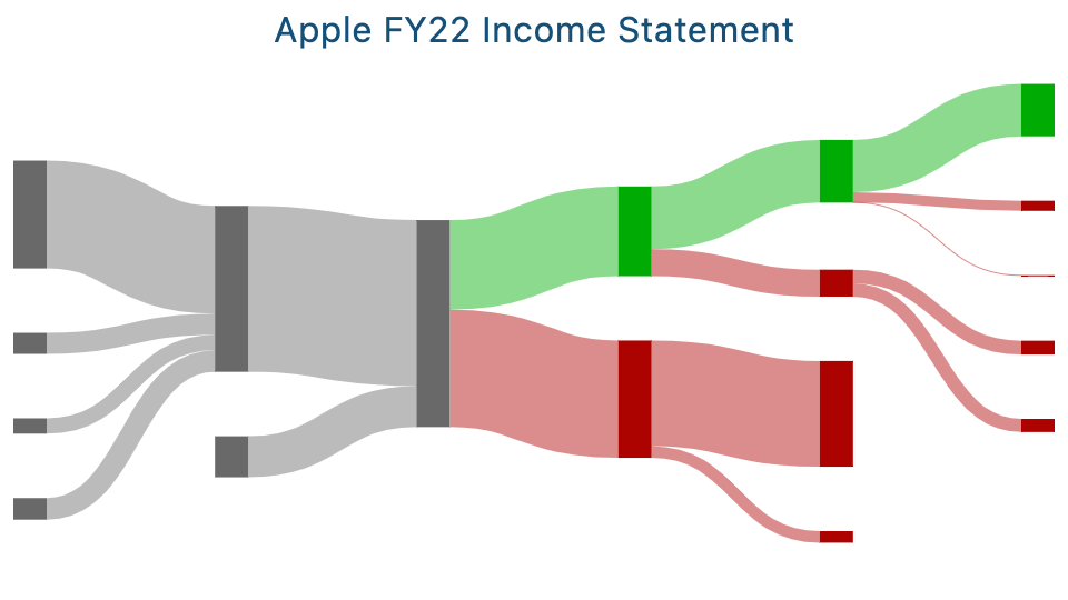
A Sankey diagram shows the flow of users through different stages of a journey, on a website or on an app.
Nodes represent an action a user did, for a given step, during his/her journey. The size of a node shows the number of users who went through this stage.
Segments (or links) are the lines connecting the nodes. Their width corresponds to the number of users who moved from one stage to the next.
To read the diagram, follow the flow of users from left to right and use node size and segment width to quickly understand how users are moving through their journey.
How to import my events data ?
All we need from you is an csv file that you can upload to your browser on the platform.
Regarding the fields that are necessary, all we need is to answer three questions.
1. Who triggered an event ? For this one, we need a column containing the user_id. The field can be a string, or an integrer.
2. What event was triggered ? For this one, we need a column containing the event_name. The field must be a string.
3. When was the event triggered ? For this one, we need a column containing the event_timestamp. All date and time format work with us.
Are sankey diagrams useful and efficient for data analysis ?
Yes, They are. Sankey diagrams can bring insane insights for companies and are definitely underrated.
We have in the team data analysts that have extensively used sankey diagrams in their projects to improve retention, monetization and engagement.
Among others, using sankey diagrams help business:
- Detect blockers users are confronted to, such as unusual drops in some funnels. Tackling them reduce churn.
- Better understand what behavior users have before and after converting, which helps smoothing their UX, which results in monetization optimization.
- Help with the decision making when it comes to decide what should the landing screen be.
- Understand how users differ based on their characteristic, indicating how to customize the app based on users attributes.
I struggle to find relevant insight with my graphs. Can you please help me ?
Of course !
Let's book a 15min call so that we can help you!
It's free, and we are pretty funny ;)
Can I try the tool without uploading my data ?
Yes, this is possible. We provide a sample of data which you can play with to get familiar with the interface (which should not take long as we made it super intuitive)